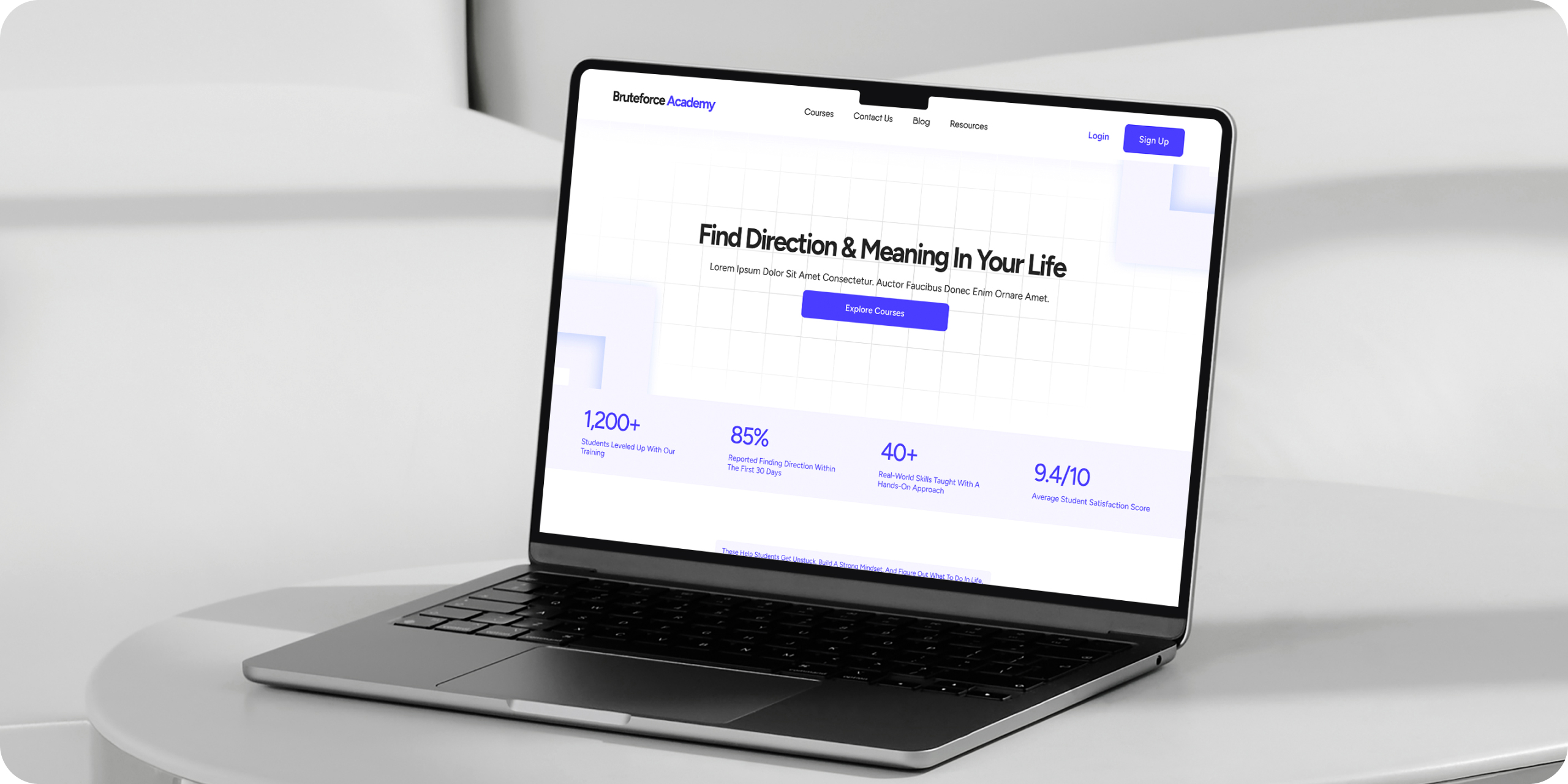
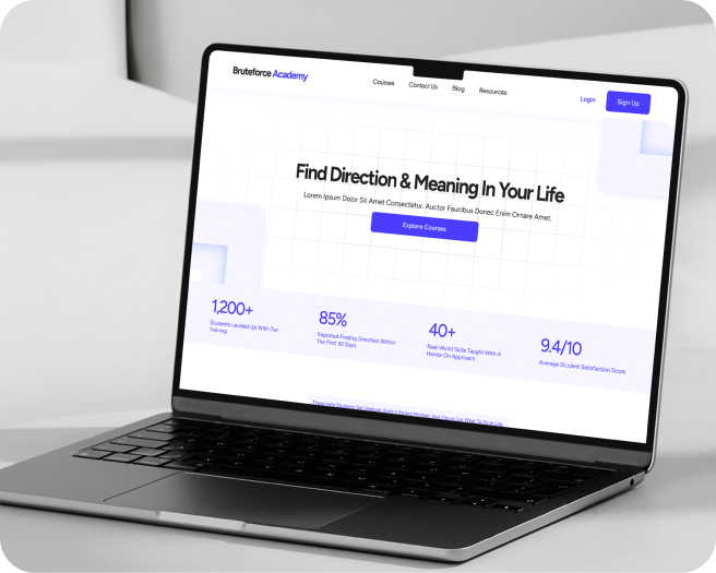
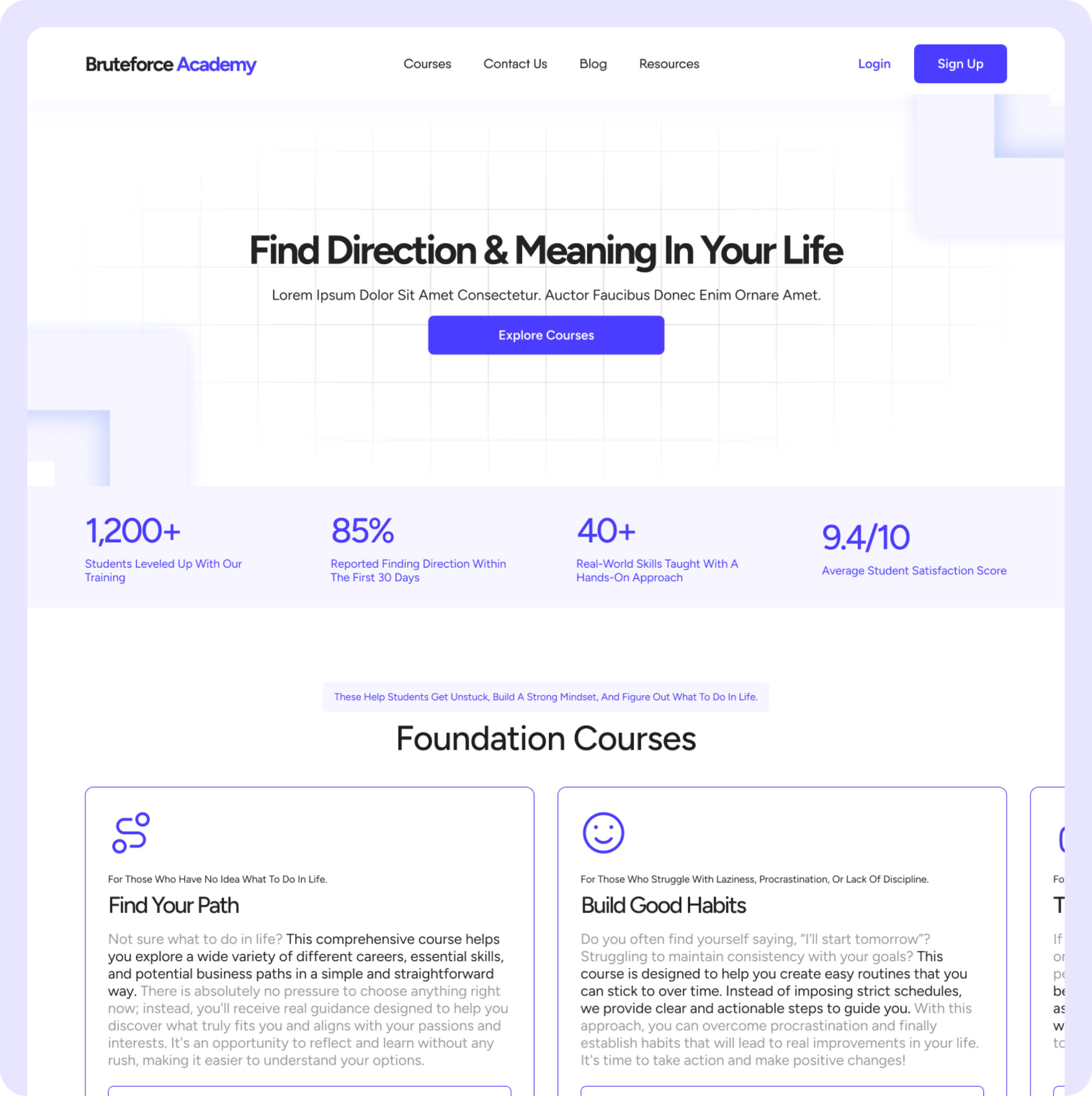
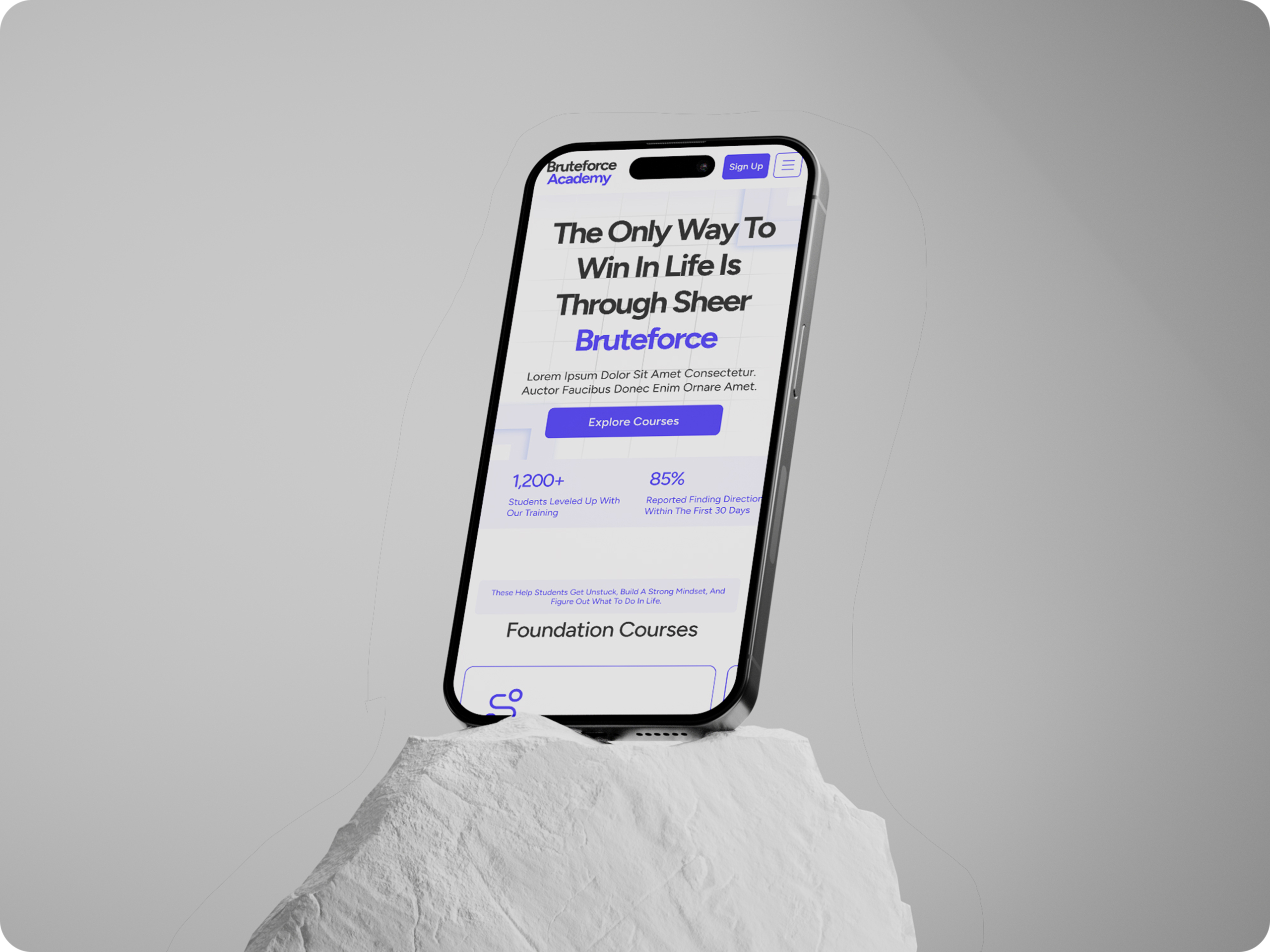
A bold, purpose-led landing page for Bruteforce Academy, a platform built to guide students who feel lost, stuck, or unsure about their future. The goal was simple, to bring clarity through design. From a strong headline to structured course breakdowns and mission-driven storytelling, the page speaks directly to those who need a fresh start.
Industry
Ed Tech
Timeline
3 days
Objective
The objetive was to design a landing page that feels honest, clear, and made for students who are confused or unsure about what to do next. We wanted the site to connect with real struggles like pressure, uncertainty, and lack of direction. The focus was on keeping everything simple, easy to understand, and purposeful from top to bottom.
The Problem We Want to Solve
Bruteforce Academy is a concept we’re building for young people who feel stuck, lost, or unsure about where they’re headed. While nothing is live yet, we designed the landing page as a starting point. It’s meant to feel real, focused, and grounded in purpose. From the first scroll, it speaks directly to the kind of person who needs it most.
Outcome
The final page does exactly that. It starts with a clear message, builds trust through real stats and testimonials, and walks visitors through what the academy is and how it can help. There’s no clutter or confusion, just a clean and focused experience that makes it easy to read, explore, and take action.
#4B3DFF
Primary Color
#F7F5FF
Neutral
#FFFFFF
Neutral
Typography
Figtree
14
16
18
24
32
56
Regular
Medium
Semi Bold
We’ve used Figtree because it’s clean, modern, and easy to read without feeling too generic.
For body text, Figtree works well in both small and medium sizes. It keeps things readable across different devices and doesn’t distract from the content. Whether it’s a course description, a mission statement, or a testimonial, the type stays consistent and easy on the eyes.
It gives the brand a grounded and confident look, especially when used in bold for headings. The letter spacing and rhythm feel balanced, which helps make the message feel clear and approachable, something Bruteforce Academy stands for.
Got a project in mind? Let's make it happen
Whether you’re aiming to grow your business, reach the right audience, or create something people genuinely enjoy using, we’re here to help you get there. No pressure, just a conversation.